Optimising with a flamethrower

A/B..N / MVT testing is many marketers' favourite pastime, however, if your company isn't structured to support optimisation then your test program can easily become a waste of time and money. Part of the problem stems from the amount of misinformation that makes people believe it's possible to generate big gains from small changes. But assuming you're running your tests correctly, you soon realise these minor changes don't make much (if any) difference. Unless you're testing tangible changes/differences then you're on a hiding to nothing, and quite often "tangible" means difficult/ time-consuming stuff. If you're limited to presentation testing (button, image, layout, headline), this can be like rubbing 2 sticks together in an effort to start a fire. You can't be constrained to presentation changes only, to step up a gear you also need to be testing business logic, now you can throw away your sticks, pick up a flamethrower and really start some fires!
Productivity
There's this debate about whether the digital revolution is really increasing productivity - Charles Duhigg, author of Smarter, Faster, Better
If your testing tool offers a WYSIWYG editor, this now means you can accomplish a lot more without those pesky people in IT slowing you down! Unfortunately, when things sound too good to be true it normally is, if you want to become productive with your test program then you'll need to be working across your company and getting buy-in for radical change.
Test less, test what matters
Our best performing customers are dead - study conducted by Fidelity
Contrary to popular belief, not everything needs testing! Adopt a common sense approach to what needs testing and what doesn't and monitor the stats when content changes are made outside of an A/B test. Alternatively, your testing program will be bogged down with never ending tests that don't gain significance.
Stop paying too much attention to optimisation blogs and reports with claims on how to make big conversation gains. Much of what is written will not apply to your business, unfortunately there's not a top 10 list of things to A/B test that will boost sales. It's you that best understands your business, customers and products and it's this knowledge that should be used for developing an optimisation roadmap.
Networking, org structures
Upgrading your optimisation toolbox to a flamethrower requires your company to be aligned around optimisation. Unfortunately, too often the optimisation team is out on a limb somewhere which makes purposeful experiments challenging. Being part of the Product team could make more sense vs. Marketing but if restructure isn't possible then networking with the right people is essential so you can trade ideas and get buy-in with those capable of making big changes to your website, shopping-cart, apps, campaigns, algorithms etc. Without this, you'll be limited to moving things around on landing pages all day or rubbing 2 sticks together in an effort to drive conversions.Okay, that's it - thanks for reading. Let me know your thoughts, ideas in the feedback section below.
Digital marketing fallacies

In this post we'll look at popular marketing activities that could be having a detrimental impact on your business and why looking at economic policies and the reason they fail can help us understand the reason why.
Henry Hazlitt was a philosopher, journalist and economist, he wrote the acclaimed book "Economics in One Lesson". In Hazlitt's book he reviews government economic policy and argues that many are fallacies, he states 2 fundamental factors are responsible for failed policy:
1) Self-interest. While certain public policies in the long run can benefit everyone, other policies only benefit one group at the expense of all other groups.
2) Failing to analyse. There's a persistent tendency to only look at the immediate effects of a given policy, or only to look at the effects on a special group, and to neglect looking into the long-run effects of a policy, not just on that special group but on all groups. It is the fallacy of overlooking secondary consequences.
It's clear to see how these factors don't only apply to economics, self-interest is a problem in many businesses and it's compounded with dysfunctional org structure that can create competing teams, bonuses and egos. Failing to analyse can be caused by system/data limitations, lack of expertise or not wanting to know; Upton Sinclair's quote can often be applied: "It is difficult to get a man to understand something, when his salary depends on his not understanding it."
Before we look at marketing initiatives fraught with mistakes, let's close this introduction by reviewing the one lesson from Hazlitt's book "Economics in One Lesson". Notice how we can just as easily swap out "Economics" with "Marketing":
ECONOMICS, as we have now seen again and again, is a science of recognising secondary consequences. It is also a science of seeing general consequences. It is the science of tracing the effects of some proposed or existing policy not only on some special interest in the short run, but on the general interest in the long run.
Discounting
Fallacy: discounting increases sales, so it must be goodNow, I'm not trying to argue that all forms of discounting are bad, however, when little thought is applied it's probably the worst marketing activity possible with severe financial/brand consequences. Discounting, is everyone's favourite marketing trick, sprinkle some here and there and if by magic sales 'pop' and everyone is a genius! With that being said I understand the short-termism of the business-world and the pressures of "making the quarterly number", therefore making a special offer can be the most effective lever in your marketing toolbox. However, it's probably fair to assume that the majority don't reflect on what the financial consequences of discounting can be, so let's look at some bad examples of discounting.
Discounting by device
Many of the examples I've seen to date will most likely suffer from market cannibalization. Unless intentional, cannibalism, which can be seen as competing against yourself, can often harm profitability. Here's a great (bad) example from match.com - one of the largest online dating and subscription services:
Prices shown to desktop devices:

Prices shown to mobile devices (*for the same subscription/product*):

At the time of writing, this is how pricing compares for the same subscription:
| Device | 1 month | Saving | 3 month | Saving | 6 month | Saving |
|
Desktop |
£42.99 | - | £92.97 | - | £113.94 | - |
|
Mobile |
£29.99 | 30% | £59.99 | 35% | £59.99 | 48% |
Strategically, I don't see how charging half the price based on your device can be a sustainable long-term plan, especially when you consider an individual can be exposed to both sets of pricing which must be off-putting. The mobile pricing will undoubtedly relate to "mobile not monetising" which is a common complaint amongst marketers, and I'm sure when the mobile pricing was dropped there was a jump in sales but would a jump be pure upside? or are there longer term ramifications? Hazlitt's point of failing to analyse would certainly apply or more comprehensively put: neglecting to look into the long-run effects and not just on a special group (mobile in this example) but on all groups (all channels/ devices). Now, I'm not suggesting that looking at the long-term effects of match.com's device specific pricing is straightforward and from a technical standpoint creating an a/b test with control group across devices would be challenging, so faced with the alternatives then sticking with price parity has to be the sensible approach vs. throwing against the wall and hoping something sticks.
Discounting by channel
A bad example of discounting by Channel is when affiliate sites offer a coupon/ discount code that applies a lower price compared to that found on the merchant's front-facing store. Have you ever gone to checkout and seen a "promo code" box and feel you're missing out, so you go search Google instead of completing your purchase? Yeah, it's annoying! But when our enthusiastic marketer opens his/her analytics report, what they see is "new" sales attributed to a different Channel, what a stroke of genius! Even crazier examples include paid media offering lower prices on special landing pages compared to going directly to the merchant's website, one can only assume to improve the advertising program ROI at the determinant of the company as a whole. These are all examples of self-interest and failing to analyse the whole group and not just a special group; sales go up in one place and down in another. Debunking such events can sometimes be as easy as looking at a first and last touch report for highlighting sales/channel cannibalization.
Discounting frequently
This article wouldn't be complete without mentioning the problem of discounting overuse, we probably all know a website or retail shop that always seems to have a sale - are sofas ever not discounted at DFS?? Your customers build a tolerance to your discounting just as you do to consuming sugary energy drinks, in the early stages you get a kick which helps with your cognitive/physical load but the effect lessens with usage, to the point your overall health deteriorates. Hopefully, that analogy made sense! Below is an anecdotal example from my inbox, I'm regularly exposed to "limited time" promotions, but if I ever decide to buy the product and it's not on "sale" then I won't make the purchase, I'll just wait a month or 2 for the next "special" event or maybe I forget and don't buy. There does seem to be a culture now with everyone expecting a discount, in such a scenario it could be worth adopting what Amazon do where everything has a discount all of the time, the prices are inflated so it allows for an always on discount.

Smarter people than me have comprehensively discussed the negative consequences of over discounting so if you want to read more I've included a link to an article by Jim Novo in the further reading section below. In summary, this is a cautionary note, discounting frequently is likely to cause problems and would require proper analysis on primary and secondary consequences on both the short and long-term (which is challenging) to be sure there isn't a detrimental impact on your business in the longterm.
A/B testing
Fallacy: winning a/b tests improve business KPIsMoving away from discounting, another common fallacy is thinking we're improving our business with lots of a/b testing. This is probably every marketeer's favourite pastime, the problem is most people don't know how to do them; this results in losing a/b tests being called winners that have no or negative impact. With the mass availability of tools such as Google Optimize, the problem will only increase, more so with the WYSIWYG editor trend. It's great that running a/b tests has never been easier, however, this only glosses over the difficult aspects of running tests, which are:
1) Validity. There is a host of reasons why your test is flawed, caused by statistical and setup errors; common problems include calling the test result too early, this happens due to lack of understanding and/or self-interest as we want our test idea to be a winner.
2) Hypotheses. What are you testing and why? Many people's idea of a hypothesis translates into guesswork, which most of the time is a waste of time. Testing larger more tangible changes, generally have a higher chance of success compared to small copy and layout changes but these generally require more effort and buy in from the broader organisation.
Even when tests are run correctly there's still the risk our winning test idea is actually a fallacy; this is due to us tracing the effects of our test in the short and not the long term, sometimes this is due to our final topic, the novelty effect.
Novelty effect
Fallacy: conversions increased with the introduction of a new feature so this must be goodThe novelty effect is the tendency for performance to initially improve when something new is introduced due to increased interest, quite often once the newness has disappeared then performance regresses to the mean. Do you remember those "punch the monkey" banner ads when they first came out?

As you may have guessed, the concept was to punch the monkey! Click through rates must have been off the charts when they first started appearing but it's easy to understand why there would be a strong correlation between time and deteriorating click throughs. If you work in Digital then you're frequently exposed to new best practises, tools and marketing tricks. A few that spring to mind and could suffer from the novelty effect are:
Exit overlays
Remember when these first came out? What a cool idea to grab an email address or offer an intensive to buy before leaving a website. But, they seem to be everywhere now, not just when exiting but on arrival too. I can't be alone thinking these are overused and annoying, as people become banner blind they must also become overlay blind. If you still think they're the coolest thing since sliced bread then here's a post on how to implement.
Cart abandonment remarketing
There are various tools that offer cart abandonment remarketing. Assuming you've entered your email then you receive communications that offer assistance or an incentive to complete the purchase. Is this cool or creepy? How many of the "recovered" sales would have purchased anyway?
Lapsed subscription discount
You have an annual subscription to a newsletter or some software and don't renew immediately, before you know it you're receiving emails with big discounts trying to win you back.
The 3 marketing activities above could bring incremental conversions, however, over a period of time the effectiveness can disappear or worse run negative. Although anecdotal, I have tech-unsavvy friends tell me how they add items to cart and intentionally abandon to see if they receive an incentive, I'll admit that I always let my subscriptions lapse and wait to see if there's a better offer coming. The more prevalent an activity is, the more expected it becomes, so previous gains can disappear further down the line. Because of this, it's important to run validation campaigns to vouch for previous winners, time can be a majorly influencing factor so don't assume a winning treatment will always be a winner, it's healthy to be a sceptic!
Right, that's it - thanks for reading. If you have any comments, questions or feedback please leave them below. And you can follow new posts on Twitter, Email or RSS.
Further reading
Economics in One Lesson
https://www.amazon.co.uk/d/cka/Economics-One-Lesson-H-Hazlitt/0517548232
When Does a Visitor Need a Coupon?
http://blog.jimnovo.com/2010/12/17/when-does-a-visitor-need-a-coupon
Conversion ranges and confidence intervals

On the 24th June, the UK nation woke to the news that the country had voted in favour of leaving the EU. This was mostly a surprise. The financial markets and sterling had rallied the night before, confident that the UK would stay. But why the confidence, what did they know? The polls had always reported a close outcome. Part of the reason for the surprise was the media (no different to a digital marketer) misleading their audience by communicating stats without a margin of error or confidence interval (which is a range of outcomes). A YouGov poll published a day before the vote showed 51% of those surveyed supported staying in the EU while 49% supported leaving. The margin of error was 3 percentage points (not mentioned by the media). Those +/- 3 percentage points means the result could equally end up (as it did):
- Leave (49 + 3) = 52%
- Remain (51 - 3) = 48%

A common question when working in Digital Marketing is: "How's the test doing?" And maybe you reply: "It's up 20%". And maybe you present your results in a similar format:

If you're communicating absolute conversion numbers - here's the problem: it's misleading. Although I've never run such a survey, I'm sure a good proportion of people would read the proceeding stats as "we're 95% confident the variant outperforms the control by 20%". Of course, we know that's not true, right?? However, it's easy to understand why people are misled. Instead, we should communicate a conversion range and confidence interval. So now we'd say "the confidence interval for the variant is: 8.3% to 9.1%'" or "a range of likely values for the population mean is 8.3% to 9.1%, with a confidence level of 95%". Using the Control and Variant confidence interval we then calculate the conversion rate delta range. VWO (Visual Website Optimiser) reports this but I've struggled to find an online tool that does this, however you can use Ewan Millar's Chi-Squared Test tool: http://www.evanmiller.org/ab-testing/chi-squared.html for calculating the confidence interval between 2 samples and then calculate the delta between the upper and lower range, so using the stats from the preceding table we end up with:

- upper range: (9.1 - 6.9) / 6.9 = 33%
- lower range: (8.3 - 7.6) / 7.6 = 9%
- which gives us a conversion range: 9 to 33%

So there you have it, start being less specific with conversion rate while adding absolute values for context. Alternatively, report on the mean value but add the margin of error. It may confuse some to start with but it's more accurate and makes more sense.
Right, that's it - thanks for reading. If you have any comments, questions or feedback please leave them below. And you can follow new posts on Twitter, Email or RSS.
Improve your experiments with a better control

Client-side testing tools render content and URL redirects on the client (browser), which will cause a small deterioration in user experience. This deterioration will vary but as marketers, we accept this based on the advantages we gain from rapid execution compared to working with a less agile server-side implementation. Client side testing tools generally have 2 methods for displaying content:
1. Overlaying
Your original or control content is loaded and overwritten with new content using JavaScript. Depending on the testing tool some use CSS to hide the original content before the new content is added to prevent a flickering effect, such as:
"visibility:hidden;" or "display:none;"
2. Redirects
Your testing software makes a client side JavaScript redirect using a command such as:
window.location = "http://www.yoururl.com/variant-a.html";Redirects are useful when your variation code exceeds 200 lines of code or the layout you're testing is radically different, it could be you're testing a completely different website on a separate domain.
So what's the problem?
Both of the methods mentioned above could negatively impact your test result leading to an invalid result, this is how:
- Your variant page takes too much time to load due to the amount of additional code being output.
- Tracking fires less consistently with a redirect or overlay.
- Page flicker caused by an overlay or redirect (probably the biggest issue to look out for, especially with redirects).
All these scenarios give the control an advantage and invalidate your experiment. Of course you could argue that all of these issues should be picked up in QA but intermittent and browser specific problems can be hard to detect. Another solution could be to run regular A/A tests but that aside it should still be a best practice to create a more 'apples to apples' environment.
Solution
The fix is simple. When using an overlay also do the same on the control but of course you overlay with the original content - so nothing changes other than we now mirror the rendering mechanism of the variants we're testing. The same applies for redirects, so we redirect the original URL back on itself - you need to be careful that you don't create a redirect loop, I wrote a quick post on how to prevent this with Adobe Target here. We now have a fairer comparison with a more consistent user experience.
Right, that's it - thanks for reading. If you have any comments, questions or feedback please leave them below. And you can follow new posts on Twitter, Email or RSS.
Preventing redirect loops with Adobe Target

This is a quick tip for Adobe Target users when creating redirect tests/offers. It's possible (as I discovered) that one day you need to redirect to the same page you have an A/B test running. An example could be, adding parameters to your Control URL which is then used by another data capture system. Redirecting to the same URL becomes a problem as you end up in a redirect loop *unless* you kill the mbox on the redirect. I've been aware of the mBoxDisable=1 URL debugging parameter and found it useful for developers that don't want to be part A/B tests while working in staging, but it can also be useful if you want to prevent a redirect loop, here's what it looks like:

It's worth noting that although we're making a call to disable the mbox it doesn't impact reporting, so the redirected user with a disabled mbox is still part of the test and reported on. And that's it. Maybe you find this useful, maybe not!
Hotjar review

I've been using Hotjar pro for a few months and felt it deserved a review. Before I get started let's take a quick look at what Hotjar does with some added commentary from my experience of using the product.
Hotjar feature set
> Heatmaps
Heatmap reports allow you to toggle between desktop, tablet and phone devices while viewing click, move and scroll data. The average fold and percentage of page scrolled are handy indicators that in the past I've had to calculate independently of the clickmap tool, so I've found this feature very useful. There's a "share heatmap" button that is great when emailing reports to people without Hotjar accounts. Probably the killer feature recently added is the capability of creating heatmaps on dynamic/session based pages (including password protected pages). This means you can look at heatmap data on shopping cart pages, we had looked at this in the past with another vendor but were restricted in having to implement a PHP API which wasn't practical.
An example heatmap from a form page:

> Visitor recordings
Visitor recordings are one of my favourite tools, you can't beat spending time watching how people actually use your website. What's really cool is you get to see what they're seeing, so if you have an A/B test running - you'll see the actual variant they're exposed to. I was quite surprised with how far this actually goes, to the point I've watched recording of users that have a browser infected with adware and you see the ads too. As with the heatmaps it's easy to share recording with a public URL (again, very handy) but the most useful feature is being able to create visitor recording on session/dynamic pages such as a multi-step shopping cart.
An example visitor recording taken from my blog:
> Conversion funnels
If you have a set of pages you want to analyse you can create a conversion funnel and watch visitor recordings of those that fallout at stages or those that go on to complete the funnel. I have only dabbled with this feature, I like the idea but to date I've mostly used the visitor recording on particular page/s that interest me.
> Form analytics
This feature allows you to see form field level abandonment rates, which fields take too long to complete and what fields are left blank. I've only briefly experimented with this feature as they don't support forms on dynamic pages yet, the good news - it's on the roadmap.
A form analysis report with drop off, time spent, left blank and re-filled data:

> Feedback polls
This has been my most used feature, it takes minutes to launch a poll (like the one below) and before you know it, highly actionable feedback start coming your way. You can trigger your poll using 4 different events:
- Immediately after the page loads
- After a delay of n seconds
- When user is about to abandon the page on a desktop device
- When user scrolls halfway down the page

> Surveys
The survey feature allows you to build fully-blown surveys using Hotjar's editor, once done they can be published via URL or just before your visitors abandon your website. The following options are available when adding questions:
- Long text answer
- Short text answer
- Radio buttons
- Checkboxes
- Net promoter score (you should see this one when you scroll down this blog post)
> Recruit user testers
Hotjar's recruiters feature allows you to recruit your own visitors for user testing. You have the same targeting options as with Polls and the following information is captured:
- Full name
- Age
- City
- Phone number
- Country (automatically captured)
- Device (automatically captured)
- Browser (automatically captured)
- Operating System (automatically captured)

What makes Hotjar standout
Okay, so here's a run down of what's impressed me since using Hotjar:
> Unlimited
There are no restrictions with server calls, number of websites (assuming they're yours) or the number of users. This is a stark comparison with other vendors where we've had to conserve server calls by only adding tracking codes at the time of launching a heatmap, video recording or survey. This "always on" approach becomes a big time saver as we can now go live in minutes with initiatives compared to days/weeks when multiple teams would have been involved with adding tracking and QA.
> Free version
There's a free version available, this is a great acquisition idea and I'm surprised more vendors don't try this. I started using the free version on this blog and soon after we started to use the paid version at my work.
> Support
The support is fantastic, I've had issues resolved within hours of reporting them. Even the free accounts get support and all my emails have been responded to in a matter of hours or less. I'm not sure how this will scale as they get more users but for now it's excellent.
> Pricing
The pricing is very disruptive when compared to more established players in the marketplace such as ClickTale. For €89 per *month* ex. VAT (yes, monthly billing opposed to annual) we get a ton of features and insight that would cost significantly more when using multiple vendors.
> Roadmap
There's a publicly available roadmap for everyone to see and understand when new features are coming: http://docs.hotjar.com/page/roadmap
What can be improved
> Integrations
Being an Adobe customer I'm keen to see integrations with Adobe Analytics and Target but there's no mention on the product roadmap. This could be an issue further down the road as heatmaps, net promoter scores and visitor recordings are all good scenarios when web analytics data would be needed for further context.
> Technical
We've had an issue with a few heatmaps when the page is using unique div ids so click data can't be reported. Moreover click data reporting can be confusing depending on how your pages are structured as each div has clicks associated with it, so if you have a button with parent and child divs then click numbers will be associated at different areas of the button when I'd expect to report one number associated with the whole button. However, heatmaps are more about looking at a picture than reporting absolute numbers so this isn't a deal breaker.
> Security
I'd like better security options, this isn't a complaint specifically towards Hotjar as most SaaS platforms don't offer much. At a minimum you should be able to restrict login access by IP address.
Wrapping up
In summary the ease of getting Hotjar's features live has been invaluable for gathering qualitative data for actionable experiment ideas, fixing content and debugging. If you're haven't tried it yet give their free version a spin - you've got nothing to lose.
Right, that's it - thanks for reading. If you have any comments, questions or feedback please leave them below. And you can follow new posts on Twitter, Email or RSS.
Is Digital Analytics misleading?

If you search on Linkedin you'll see that Digital or Web Analytics is the de facto title/department name for many of us, but is the phrase misleading? First off, what is Digital Analytics? Judah Phillips wrote the book Building a Digital Analytics Organization and describes it as:
Digital analytics is the current phrase for describing a set of business and technical activities that define, create, collect, verify, or transform digital data into reporting, research, analysis, optimizations, predictions, automations, and insights that create business value.
The activity of digital analysis, at the highest and best application, helps companies increase revenue or reduce cost.
Web Analytics is the measurement, collection, analysis and reporting of Internet data for the purposes of understanding and optimising web usage.
The definition of 'analytics' is a broad one, leading to confusion among enterprise users
...
When Gartner conducted an informal survey among users about what the term means, the answers ranged from online analytical processing (OLAP) to monitoring call centres to reporting and data mining.
...
Gartner had more questions than answers after the survey.
The endgame for Digital Analytics is consistently described as optimisation. We measure for reporting, we use reports for analysis and we use analysis to optimise. Good existing department names within the organisation include; Customer Acquisition, Customer Support, Customer Retention. A bricklayer isn't called a brick-picker-upper, a restaurant server isn't called a food-carry-outer. Moreover, neither role uses a buzzword to inaccurately describe a collection of tasks. Scrutinising semantics may seem pedantic but confusion can be caused by organisational fractures. The rising trend of companies with a separate optimisation department is evidence of this. Many working within these optimisation silos will baulk at the idea of using Adobe/Google Analytics, consequently leading to a less scientific approach to experimentation with hypotheses being swapped for opinions and guesswork.
Having a department name aligned with its goal will have a positive business impact (IMO) as physiologically employees are reminded of their endgame. Let's face it, when's the last time someone understood what you meant by telling them you worked in Digital Analytics? ...okay, web/digital optimisation might need further explanation, but a few might know what you're talking about!
What do you think? Is this petty-mindedness or it does make a difference?
Create an exit popup with Google Tag Manager & Ouibounce

Have you ever wanted to add one of those popup windows that disable the page content and make you acknowledge an offer when you try and exit? The popups are called 'modal windows' and according to Wikipedia: 'A modal window is a graphical control element subordinate to an application's main window which creates a mode where the main window can't be used'. There are companies that sell exit intent technology, most notably BounceExchange (at $10K per month though it's not cheap). But fear not, this post will show you how to add much of the same functionality using the free and open source JavaScript library from Ouibounce and the free to use Google Tag Manager.
First off: I'm sure exit intent windows can help achieving a conversion goal in certain scenarios, however it's a balancing act between this and not annoying visitors, so you may want to test this over a good period of time and be sure returning visitors aren't negatively influenced. Anyway, back to our modal window example and how to display it when the visitor is about to leave.
Give it a spin!
[Note: this intentionally won't work on on a mobile device] Act as if you're about to leave this page and see it in action, and while you're at it; sign up for my newsletter! The modal window has been set to "aggressive mode" which means you can refresh this page and you can initiate the modal again, non-aggressive mode would use a cookie to only show the popup window once per visitor.
Okay, so now that you've seen it in action - on to the steps:
Step 1: Add Jquery & CSS
Make sure you have jQuery included on your landing page:
<script src="https://ajax.googleapis.com/ajax/libs/jquery/2.1.3/jquery.min.js">
</script>
Now grab the CSS here: http://carlsednaoui.github.io/ouibounce/modal.css and add to your page, this can obviously be adapted to your website brand.
Step 2: Add your hidden modal window
Here's the modal source code taken from the Ouibounce website, you can format however you want however don't change the id or class names, some classes can be omitted, such as the title and footer - so experiment with what you need.
<div id="ouibounce-modal">
<div class="underlay"></div>
<div class="modal">
<div class="modal-title">
<h3>This is a Ouibounce modal</h3>
</div>
<div class="modal-body">
<p>You can style your modal however you want.</p>
<br>
<p>Close this modal by clicking "No Thanks" or outside of the modal.</p>
<form>
<input type="text" placeholder="your@email.com">
<input type="submit" value="learn more »">
</form>
</div>
<div class="modal-footer">
<p>no thanks</p>
</div>
</div>
</div>
Step 3: Create the tag in Google Tag Manager
Go to 'Tags > New' and add the code below then hit Continue and on to the targeting.
// Use the snippet below for including the library or host yourself
<script type="text/javascript" src="https://cdnjs.cloudflare.com/ajax/libs/ouibounce/0.0.11/ouibounce.min.js"></script>

<script type="text/javascript">
// By default "aggressive mode" is set to false, so the option
// below can be removed for one popup per visitor
var _ouibounce = ouibounce(document.getElementById('ouibounce-modal'), {
     aggressive: true});

// Hides the modal when visitor clicks outside of the modal window
$('body').on('click', function() {
     $('#ouibounce-modal').hide();
});

// Hides the modal when visitor clicks on the close / footer link
$('#ouibounce-modal .modal-footer').on('click', function() {
     $('#ouibounce-modal').hide();
});

//  jQuery stuff to keep modal window open when it's meant to
$('#ouibounce-modal .modal').on('click', function(e) {
     e.stopPropagation();
});
</script>
Step 4: Target the modal
URL
I only want this modal window to appear for this blog post so I've created a tag that's triggered on Some Pages which in my case is when the URL contains 'create-exit-popup-with-google-tag'.
Step 5: Create exceptions
DOM ready
We want the tag to fire only when the page is ready and our modal window is accessible so we add a blocking trigger to prevent our tag firing until the Document Object Model is ready.
Excluding mobile
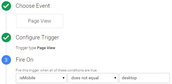
Exit intent detection *isn't supported on mobile* devices and I'm not sure you'd want to do it anyway, to be sure our tag won't fire and to save page load for mobile devices we can exclude our modal window tag by adding some custom JavaScript as a User-defined Variable:
function()
{
    // detect mobile device
    var mobile = navigator.userAgent.match(/Android|BlackBerry|iPhone|iPad|iPod|Opera Mini|IEMobile|webOS/i);

    if(mobile)
    {
        return mobile;
    }
    else
    {
        return "desktop";
    }
}
Once that's saved it can be set as a blocking page view trigger. The above code returns a mobile name when it's a mobile device and the value "desktop" when it's not. So if the value is not "desktop" then this rule will fire and block our modal window code from being executed. Adding the blocking rule and referencing our User-defined Variable, looks like this:
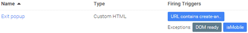
That's everything done, you can now save the tag, QA and publish and you're good to go! Our saved tag with firing triggers looks like this:
Right, that's it - thanks for reading. If you have any comments, questions or feedback please leave them below. And you can follow new posts on Twitter, Email, RSS or by trying to leave this page!
What to use for personalisation?

Personalisation is up there with some of the top digital marketing buzzwords, but how do you do it? Let's be honest, unless you're Amazon it's unlikely people are logging into your website when they visit, so you have no idea on age, gender, purchase history, etc and you might not even have an account login, so what do you use?
Personalisation vs Targeting
Before we start it's worth being on the same page with what Personalisation is, as quite often marketers discuss Personalisation and Targeting interchangeably, here's how Wikipedia describes the 2:
- Personalisation, also known as customisation, involves using technology to accommodate the differences between individuals.
- Targeting is to make a thing or group of things a target, to select it or them to be acted upon.
Outside of one-to-one marketing, much of what is termed as Personalisation could perhaps be better described as content customisation. With that in mind, let's look at some targeting/personalisation examples that don't require a logged-in state or account id:
Self-identification
Why guess? Just ask 'em! A simple example below from British Airways asking for your country and language as you visit their website; this is a far better approach compared to when Google has a guess and shows you the default language of wherever you're located. This could be expanded onto many levels, how about asking homepage visitors to identify themselves into customer segments (business, consumer, support, agent, reseller). Armed with this information your personalisation capabilities have significantly increased.

Technology
Browser
According to surveys, if you're using Internet Explorer you're above 40 and technically less savvy; Chrome user and you're younger and more "with it". I have observed staggering conversion rate difference between browser types. I'm sure this is why Adwords (& others) don't offer browser targeting as much of their ad revenue would vanish overnight. So if correlations between browser and age are believed, this can be powerful especially if you offer products that target certain age groups.

Operating System
While operating system conversion rates will most likely vary, my experience (to date) suggests it's less predictable and persona assumptions are harder to make, that being said if you're offering OS specific products it's a highly predictive variable; for example you offer Windows and Mac hardware/software.
Device
Responsive/ adaptive design is one of the most popular forms of content customisation, with content and sometimes the offer changing radically based on the device. Customisation needs to be approached with caution as users are often in research-mode on mobile and want to see the same content as a desktop user. If your analytics data shows that mobile users don't convert as well as desktop, maybe the user experience should be simplified so that mobile users can be educated easily with more selling options left to the desktop/tablet experience.
Onsite behaviour
When visitors are exposed to paid search landing pages, visit a product page or take an action such as download, make a purchase, search onsite they are self-identifying and this information can be used for returning visits, for example, a homepage that helps them complete their goal easier.
Location
Depending on what you do, this could be considered the low-hanging-fruit. Popular products can vary across geo and region so this can influence homepage offers. If you're a multinational company this could be an opportunity to adapt creative to the country or city so the experience feels more local and if you have a multi-language website then your personalised language should read like it was written by a native and not Google Translate.
Time
The big one here could be seasonality, based on the period of time and sometimes used in conjunction with location it might mean certain products are more popular and content can be adapted accordingly. Depending on your business this could be done at a granular scale for example weekends or even time of day.
New vs. Returning
How does visitor behaviour differ? Are new visitors less likely to convert compared to repeat, if so does research material need to be more prominent for new visitors while returning visitor content can be more focused towards conversion?
Referring URL
This could be an easy way for adapting content if you have some significant referrers where the referring content helps identify the persona.
Tracking always on personalisation
So how do you know if it's working and there's an ROI? Where possible I would recommend an always on control segment so that measurement is possible, as an example: you decide to offer around the world cruises on your travel website homepage to Internet Explorer visitors as this is an activity popular with the elder generation. Instead of personalising to 100% of Internet Explorer visitors you would reduce the sample to let's say 90 or 95 percent with the remaining ratio receiving the default. This makes measurement possible, things change so this is why you'd want to be measuring all the time and not to assume after an initial successful test period that the personalisation will work forever. Microsoft's new browser, codenamed "Project Spartan" could be a huge success and steal back market share from Chrome which would play havoc on your age based boat cruise personalisation.
Right, that's it - thanks for reading. If you have any comments, questions or feedback please leave them below. And you can follow new posts on Twitter, Email or RSS.
Optimisation analysis. Know your visitor

If you had to sum up in a few words how to analyse for optimisation it would be this: know your visitor. Knowing nothing in an anonymous visitor environment would equal a spray and pray optimisation approach. Observing visitors and how they differ will facilitate the formulation of hypothesises for experimentation or recommendation for change. There's always an array of analysis that's possible, even in an environment that lacks user login data. So let's look at examples that are instantly available in your digital analytics system.
A good way to start making observations about visitor differences is to break down main KPIs and compare against dimension values. As an example if you had an online wine store, some key metrics would be: order rate, average order value, average order quantity and bounce rate. Some worthwhile dimensions for comparison are: geo, browser type, device, time to purchase, visitor frequency, checkout, traffic source and products purchased. Our wine store investigation would involve a thorough review of each KPI, so starting with order rate, we'd iterate through each dimension one level deep. When analysing ratios such as order/conversion rate, I would also look at absolute order numbers for giving context and gauging popularity, so you could think of this as an order rate and orders investigation. If we took 5 dimensions to analyse this would output 10 investigations:
| Dimension combination | Potential questions |
| Geo-> traffic source | How do these vary? Does natural or paid search convert better in the UK? Is traffic distribution across channels even or skewed towards a poorer performing traffic source? Maybe email is The Channel and some countries have fewer email addresses? |
| Geo-> checkout | If there's order rate differences across location, why could that be? How about: a popular payment method missing in a particular country or suspect translations? |
| Geo-> product | What's the look-to-book ratio for the top 10 selling wines and how does it compare across geo? What do these differences mean? Does homepage content properly represent what's most popular in each country? |
| Geo-> browser type | How does the user's browser impact order rate? Are Chrome users more likely to purchase? Could this be useful for personalisation? |
| Traffic source-> checkout | There will most likely be differences here, is there anyway to make changes to the checkout experience per traffic source? |
| Traffic source-> product | Are certain traffic sources more likely to purchase particular wines and can this be used for personalisation? |
| Traffic source-> browser type | How does browser conversion rate vary across geo? Are Firefox visitors in Germany more likely to purchase compared to Internet Explorer visitors in the US? |
| Checkout-> product | If the checkout order rate varies based on the product, why could that be? Do the descriptions or thumbnail images need a review in the cart? |
| Checkout-> browser type | Are there browser incompatibility issues? IE 8 causing problems again?! |
| Product-> browser type | Are visitors of certain browsers more likely to purchase certain wines? If so can this be used for personalisation? |
Once the above investigations are complete we do the same for the other KPIs and when exhausted we can go another dimension deep (when it makes sense), for example: Traffic source-> checkout-> geo. I find it helpful to export the data to Excel where you can apply conditional formatting, the average order value analysis below asks questions straight away; why are the French so financially frugal? Don't they like our fine British wine?!

You will have more dimensions depending on your business which all play a role in better understanding who your visitors are and how they behave. I find this systematic approach helpful otherwise it can seem overwhelming on where to start.
I hope this was useful and thanks for reading. If you have any comments, questions or feedback please leave them below. And you can follow new posts on Twitter, Email or RSS.
Subscribe to:
Posts
(
Atom
)


